

Confused by website terminology?
If so, here’s a handy glossary (all in plain English) that’ll quickly get you up to speed and demystify the language of web technology.
Once you understand basic website jargon, you’ll never get intimidated or befuddled the next time a web designer or web developer spews techno-babble.
Basic Anatomy Of A Website
Let’s start by defining the various parts of a website:
Header
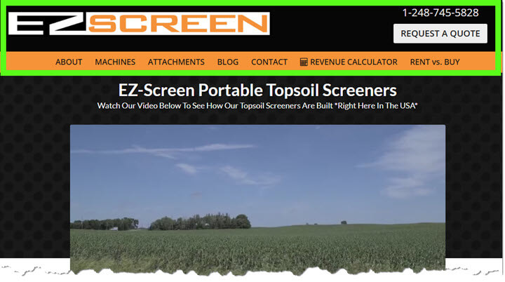
The header is the top section of a website, where you’ll usually find the logo and the site’s navigation menu. It’s that steady, reliable part of the page that stays visible no matter where visitors click on your site.
Years ago, headers often featured big banners or graphics to promote a brand—similar to the cover photo on a Facebook page. But these days, the trend is to keep things simple, with just a logo, navigation, and possibly a call-to-action button to keep your website looking clean and modern.
Pre-Header
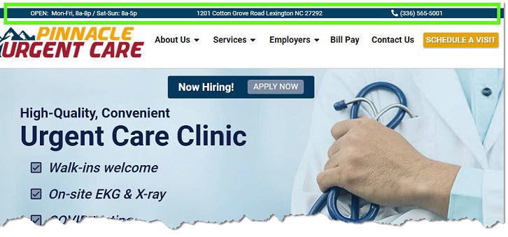
The pre-header is the thin strip that sits above the main header. It’s often used to display helpful information like your contact details, business hours, special offers, or even secondary navigation links. Think of it as a small but mighty space for quick-access details that your visitors might appreciate seeing right away.
Favicon
A favicon is the small icon that appears in a browser tab next to your website title. It’s usually a simplified version of your logo or brand mark. Favicons help visitors quickly identify your website when they have multiple tabs open, and they add a polished, professional look to your site.
Navigation (aka Navigation Bar or Main Menu)
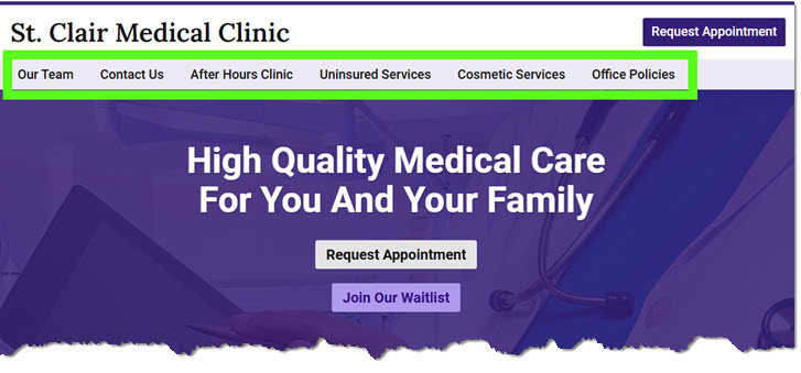
The navigation is the set of links at the top of a website that helps visitors find what they’re looking for. These links are usually part of the header or located just below it.
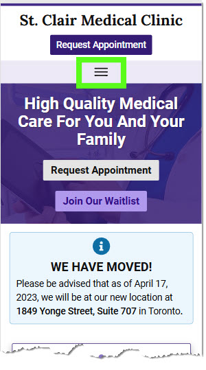
On mobile devices, navigation links often transform into an icon with three stacked lines—commonly called a “hamburger” menu because it resembles a side view of a hamburger. Tapping this icon reveals a vertical toggle or horizontal flyout menu, making it easy to browse even on smaller screens.
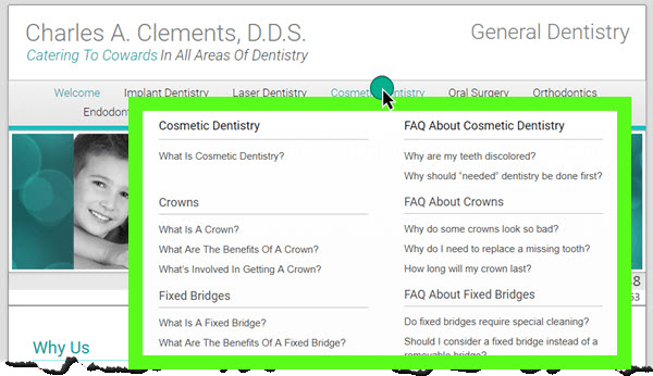
For more complex websites with tons of pages, you might encounter a “mega menu.” This is a dropdown menu that appears when you hover over or click a link in the main navigation. It displays multiple categories and subcategories, neatly organizing many links—kind of like a visual sitemap.
Breadcrumbs
Breadcrumbs are a type of navigation that shows visitors their location within a website’s hierarchy. They usually appear near the top of the page and look something like this:
Home > Blog > Latest Posts > Post Title
Breadcrumbs make it easy for visitors to understand where they are on your site and quickly backtrack to previous pages. They’re especially helpful for larger websites with lots of categories and subpages.
Website Content
When it comes to written text, you’ll often hear it called web copy or body copy, but website content goes beyond just words.
Website content is everything on your site that communicates your message to visitors. It includes all the elements people interact with—text, images, videos, audio, and more. It’s the full collection of materials designed to inform, engage, or persuade your audience—the whole package, or as some might say, the whole shebang.
Homepage (or home page)
The homepage — also called the front page or main page — is the starting point of most websites. It’s often the first page visitors see and serves as a central hub to guide them through your site.
The homepage sets the tone for the entire website, giving visitors a quick sense of who you are, what you do, and where they should go next. It’s like the front door to your business online.
Common elements on a home page include:
A common website design best practice is to link your logo to the home page. This gives visitors an easy “escape” or “reset” if they ever get lost while navigating your site.
Homepage Hero Area (aka Feature Area aka Headline Area)
The Homepage Hero Area is the top section of a homepage that grabs your attention and introduces the site’s primary message. It often spans the full width of the page and typically includes key elements like:
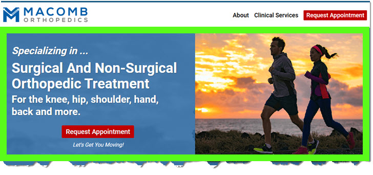
The term “hero” comes from traditional print media, where it referred to the main headline and image meant to grab attention. In web design, the hero area serves a similar purpose: to create an immediate and lasting impression.
Slider
A slider is a feature on a website that displays a rotating series of images, like a slideshow. The images usually slide horizontally from one to the next, though some sliders use fade effects instead.
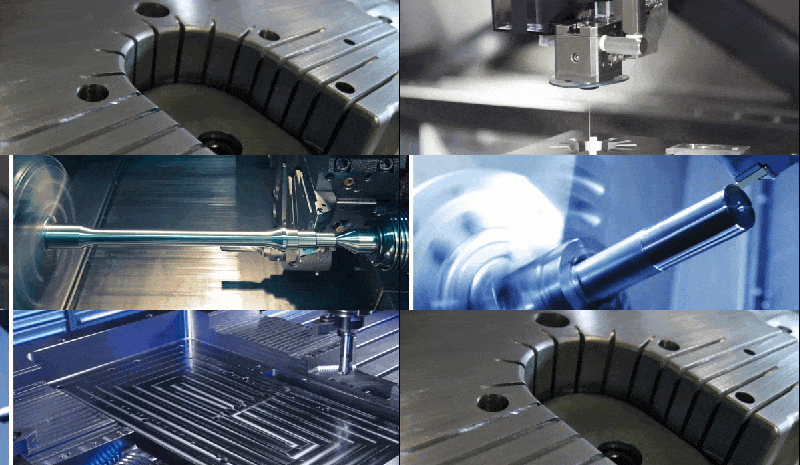
You’ll most often find sliders on homepages, either as a replacement for a hero image or as an additional design element.
While sliders used to be a common design trend, their popularity has decreased in recent years. because they can slow down your site’s load time and don’t always offer the best experience for mobile users. Although sliders can add some visual interest, sliders are often more decorative than practical.
Website Content
When it comes to written text, you’ll often hear it called web copy or body copy, but website content goes beyond just words.
Website content is everything on your site that communicates your message to visitors. It includes all the elements people interact with—text, images, videos, audio, and more. It’s the full collection of materials designed to inform, engage, or persuade your audience—the whole package, or as some might say, the whole shebang.
Alt Text
Alt text (short for “alternative text”) is a brief description added to images on a website. It serves two main purposes:
- It makes websites more accessible by describing images to visually impaired users who rely on screen readers.
- It helps search engines understand what an image is about, which can improve your website’s SEO.
For example, if you have an image of an office space, instead of leaving it without a description, you might add alt text like: “Photo of a modern office space with large windows and desks.”
Sidebar
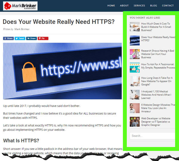
A sidebar is the narrow vertical column that appears alongside your main website content. It’s often used to display things like advertisements, links to other content, calls to action, or a search box. Think of it as a supporting area for secondary information that complements the primary content.
In recent years, many websites have moved away from using sidebars altogether, opting instead for a single, full-width layout. For some websites, removing the sidebar makes sense; for others, it doesn’t. The decision really comes down to personal preference, the user experience you want to create, and which layout (sidebar vs. no sidebar) works better for your goals—like improving readability or increasing conversions.
Sub-Footer
The sub-footer is the section that appears at the bottom of a webpage—just above the main footer—and is consistent across your site. Think of it as a secondary navigation bar that provides additional points of access or contact details once visitors have scrolled through the primary content. While its content varies by site, a sub-footer typically includes elements such as:
The sub-footer is designed to serve as an added layer of user convenience, enriching the overall navigation experience without being as formal as the main footer.
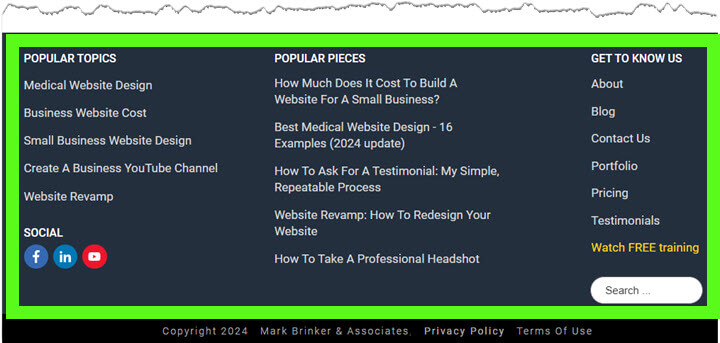
Footer (The "True" Footer)
The footer is the final, definitive section at the very bottom of a webpage. It typically contains essential legal, informational, and administrative details that are less frequently updated but are critical for compliance and user trust. Common footer contents include:
This section is static across the entire site and represents the definitive end point of your webpage content.
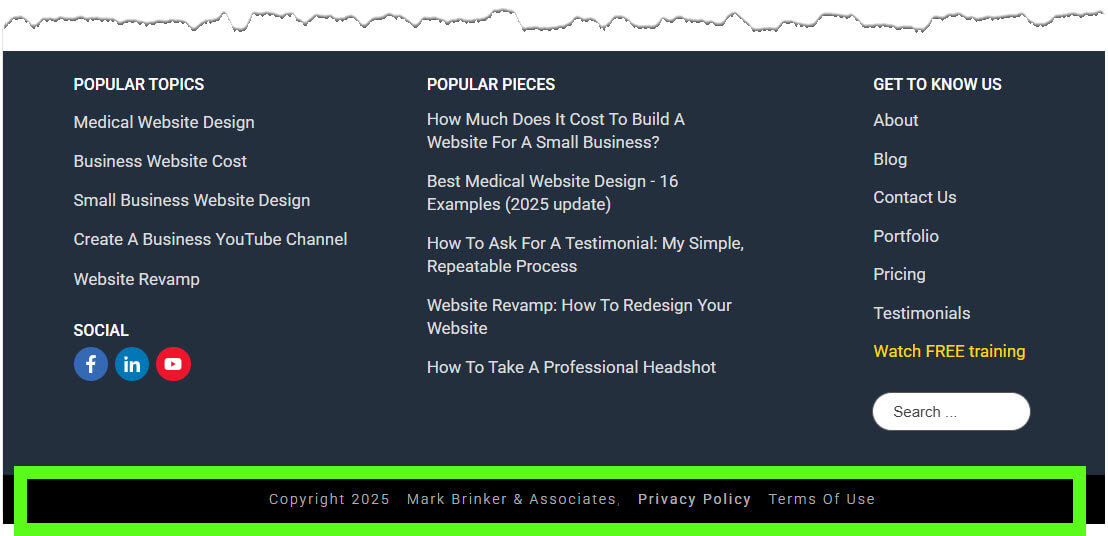
Note: Although many people refer to both areas (i.e. sub-footer and footer) as the “footer,” they're actually two different things. The sub-footer typically contains secondary navigation and quick-access details, whereas the "true" footer is reserved for legal and administrative information.
Landing Page
A landing page is a specific page on your website where visitors “land” after clicking on an ad—whether it’s from Google, Facebook, or anywhere else.
Landing pages are designed differently than regular website pages. Distractions like headers, footers, and sidebars are often removed or minimized to keep visitors focused.
The main goal of a landing page is to get the visitor to take a specific action—like downloading a report, signing up for an email list, or making a purchase. To maximize conversions, the content on a landing page is laser-focused, guiding visitors toward that single objective.
Here's a landing page example.
Call To Action (aka CTA)
A call to action (or CTA) is a specific and direct request asking visitors to take a desired action. CTAs can take many forms: buttons, popups, ribbons, slide-ins, email opt-in boxes, or even a simple text link.
A good call to action doesn’t have to be pushy or over-the-top. Sometimes a simple “click here” or “learn more” works perfectly. The key is to gently nudge your visitors toward the next step you want them to take—whether that’s signing up, making a purchase, or contacting you.
Above the Fold
“Above the fold” refers to the part of a webpage you immediately see before you start scrolling. Placing your call-to-action (CTA) above the fold ensures visitors see it right away, increasing the likelihood they’ll take action—like clicking a button or filling out a form.
The term “above the fold” comes from the newspaper industry, where the most important headlines and images were placed on the top half of a folded newspaper to grab readers’ attention with a quick glance — like when they walk past a newsstand.
Blog
A blog is a type of website—or a section of a larger website—that features content published as individual posts in chronological order, like journal entries in a diary.
So what’s the difference between a blog and a standard website? It comes down to how the content is structured and presented:
Blogs also tend to have a more casual, conversational tone compared to standard web pages, which are usually more formal and informational, focusing on products, services, or company details.
A blog can stand alone as its own website, or it can live as a section within a larger website—just like this blog post you’re reading right now.
For more info on the similarities and differences between a blog and a website, check out my video on my YouTube channel.
Card Design (aka Tile Design or Grid-Based Design)
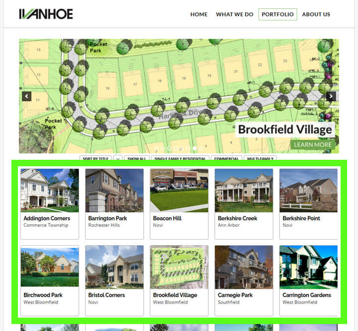
Card design organizes content into visually distinct “cards” or tiles, often arranged in a grid layout. Popularized by sites like Pinterest, this design style is clean, easy to scan, and works well on both desktop and mobile devices.
Card design can be used in a variety of ways:
It’s a flexible, visually appealing way to present information. With a little creativity, the possibilities are endless.
Additional Terminology Of Modern Websites
WordPress
WordPress powers millions of websites worldwide and is one of the most popular tools for building and managing websites.
Think of WordPress as the operating system for your website—similar to how Windows runs on a PC, macOS on a MacBook, or iOS on an iPhone. It’s a content management system (CMS) that allows you to easily add, remove, or update content without needing advanced technical skills.
Here’s how WordPress works:
- Themes: A WordPress theme controls how your site looks. It’s what transforms WordPress into a functional website. There are thousands of themes—some free, some paid—and most can be customized to match your company’s brand. Using a theme is far faster (and cheaper) than building a website entirely from scratch, like we had to do back in the early 2000s.
- Plugins: Plugins add functionality to your site, much like apps on your phone. With tens of thousands of WordPress plugins available, you can add features like contact forms, image galleries, site security, shopping carts—pretty much anything you can imagine.
Thanks to themes and plugins, WordPress makes it possible to build a custom, high-quality website for a fraction of what it used to cost.
WordPress Page vs. WordPress Post
This takes a bit of explaining, so I wrote a whole piece on the similarities and differences between WordPress pages and posts, which you can find here.
Hosting
To have a website on the internet, it needs to be hosted on a web server. Think of hosting as the piece of land where your website “lives.” Just like you need land to build a house, you need a server to store your website’s files and make them available to people on the internet.
There are plenty of companies that offer website hosting services, like HostGator or BlueHost, which rent out space on their servers so your site can be available online 24/7.
Caching
Caching is the process of storing a temporary version of a website or webpage to help it load faster. When someone visits your website, a cached version can be delivered quickly instead of forcing the browser to fetch everything from scratch.
Caching improves site speed, reduces the load on your web server, and makes for a smoother experience for visitors—especially for those who come back to your site repeatedly.
Domain Name (aka URL)
A domain name is the address people type into their browser to visit a website—like Amazon.com, CNN.com, or markbrinker.com.
Behind the scenes, every website is identified by an IP address, which is a long string of numbers like 143.398.884.342. But let’s be honest—who can remember all those digits? That’s why domain names exist: they’re easier to remember and use words instead of numbers to identify a website.
Fun fact: The term URL stands for Uniform Resource Locator — it’s the technical name for a web address.
Domain Registrar
A domain registrar is where you purchase and register your domain name—kind of like getting a license plate for your car from the DMV.
There are plenty of domain registrars online, such as NameCheap.com or GoDaddy. Once you register your domain name, it’s officially yours (as long as you keep renewing it).
301 Redirect
A 301 redirect is a way to permanently send visitors (and search engines) from one URL to another. It’s often used when you update your website’s structure, change a page’s URL, or move your site to a new domain.
For example, if you change a page’s URL from yourwebsite.com/services to yourwebsite.com/our-services, a 301 redirect ensures anyone visiting the old link will automatically land on the new page. It also tells search engines to pass along any SEO value from the old URL to the new one.
404 Error Page
A 404 error page appears when someone tries to visit a page on your website that doesn’t exist — either because the page was deleted, the URL was mistyped, or the link is broken.
While a default 404 page simply tells visitors the page can’t be found, a well-designed 404 page can do more. It can include helpful links, a search bar, or even a friendly message to guide visitors back to where they want to go, instead of leaving them frustrated.
DNS
DNS stands for Domain Name System. Think of it as the phone book of the internet.
As mentioned earlier, humans use domain names (like markbrinker.com) instead of long, hard-to-remember IP addresses. When you type a domain name into your web browser, your internet service provider (ISP) connects to a domain name server—one of many located around the world. The DNS server quickly looks up the IP address linked to that domain name and routes you to the website you requested.
resume here
HTML
HTML stands for Hyper Text Markup Language, and it’s the standard language used to create websites and web pages. Invented in 1991 by Tim Berners-Lee (the creator of the World Wide Web), HTML allows developers to structure content on a webpage using tags for elements like headings, paragraphs, images, and links.
Fun fact: HTML inspired the name of the original Hotmail email service, launched in 1996. The founders cleverly included “HTML” in the name to highlight the web-based nature of their email platform.
CSS
CSS stands for Cascading Style Sheets. While HTML is used to create the structure of a webpage, CSS is what makes it look good. It controls the design—things like fonts, colors, spacing, and layout.
CSS also determines how a website appears on different devices, ensuring it looks great whether you’re viewing it on a desktop, tablet, or phone.
Website Builder
A website builder is an all-in-one tool that allows you to design and build a website without needing to write code. Website builders typically feature drag-and-drop editors, making them easy to use, even for those with minimal technical experience.
Popular examples of website builders include Wix and Squarespace. These platforms simplify the entire process by bundling everything you need—like hosting, design, and domain management—into one system.
A page builder, on the other hand, is slightly different. Page builders are tools (often plugins) that allow you to create and customize individual pages on platforms like WordPress. For example, tools like Elementor and Thrive Architect are WordPress page builders that let you design pages with a drag-and-drop editor, while still leveraging the flexibility of WordPress.
Website builders are great for quickly getting a website up and running because they limit complexity. However, they can lack the customization and scalability of page builders on open platforms like WordPress.
Note: While drag-and-drop tools are a game changer, you’ll still need a basic understanding of HTML and CSS for fine-tuning your website. Sorry to rain on the parade. 😮
Mobile Responsive
A mobile responsive website automatically morphs to fit the shape and size of the screen it’s being viewed on—whether that’s a phone, tablet, or desktop. It uses CSS to adjust the layout, navigation, and font sizes seamlessly, so the site is easy to use and read on any device.
More than 50% of all web traffic comes from mobile devices, so mobile responsive design has become the standard for modern websites. If you have to pinch and zoom to make text readable, that’s a sure sign the website is not mobile friendly.
SSL
SSL stands for Secure Socket Layer. An SSL certificate encrypts the data sent between a website’s server and your browser, ensuring that hackers can’t intercept or read it.
You can tell if a website is secure by looking for the padlock icon in your browser’s address bar:
- A non-secure website starts with “http” (Hyper Text Transfer Protocol).
- A secure website starts with “https”, where the “s” stands for secure.
SSL certificates have become standard for all websites, even those that don’t collect sensitive information like contact details or payment data. Visitors expect to see the SSL padlock icon, and web browsers often flag non-SSL websites with warnings that can make users feel nervous or unsafe.
SEO
SEO stands for Search Engine Optimization. It’s the process of configuring your website to get free traffic from search engine results pages (often referred to as SERPs).
SEO can seem like a large and complex topic—and it is—but at its core, it’s about creating content that search engines value and people actually want. To get ranked in the organic search listings, you need to produce content that:
- Is high quality and genuinely helpful.
- People actually want to read, share, or link to.
- Is properly formatted on your site (known as On-Page SEO).
That said, there’s a lot of confusion and wildly unrealistic expectations around SEO. It’s important to know that SEO takes time, effort, and strategy to be effective.
If you’re looking for more in-depth information about SEO, I highly recommend checking out the work of Brian Dean, one of the leading experts in this space.
Google Analytics
Google Analytics is a free service from Google that provides statistics about your website—like how many visitors you’re getting, which pages they’re viewing, and how long they’re spending on each page.
To use Google Analytics, all you need to do is install a small tracking script on your website, and you’re good to go.
By collecting this data, Google Analytics removes the guesswork and helps you see what’s working on your website and what isn’t.
Email Service Provider (ESP)
An email service provider (sometimes called an email management service or EMS) helps you build, manage, and communicate with your list of email subscribers.
Popular examples of email service providers include MailChimp, Aweber (which we use), Constant Contact, ConvertKit, GetResponse, and ActiveCampaign.
Using an email service provider offers several key benefits:
- Automation: Users can add or remove themselves from your list automatically. You can also set up emails to send based on specific user actions (e.g., signing up for your list).
- Scalability: Send a single broadcast email to hundreds or thousands of subscribers with just a click—something that’s nearly impossible to do manually.
- Deliverability: Email service providers are “whitelisted,” so your messages are less likely to be flagged as spam. If you try sending too many emails in quick succession with tools like Outlook or Gmail, your ISP might block them.
- Compliance: Helps you stay compliant with email regulations like the CAN-SPAM Act to avoid penalties.
- Reporting & Tracking: See valuable stats like email open rates, link clicks, and which subject lines perform best.
An email service provider makes email marketing more efficient, reliable, and measurable, helping you connect with your audience at scale.
Conclusion
I hope you found this mini crash course on website terminology helpful.
The good news? You don’t need to understand all the tech behind the scenes to have productive conversations with a web designer or developer. A basic grasp of these terms is more than enough to help you feel confident and informed.
I’ll be updating this glossary over time, so if there’s a term I missed or one you think should be added, let me know in the comments below. Thanks for reading! 😉

This is actually pretty helpful! I always get confused by some of these terms, especially "hero area." This cheat sheet makes it so much easier to understand the basic parts of a website. Thanks for sharing!
First thing this morning I needed to know how to refer to the different sections of a website. "Parts of a Website: A Cheat-Sheet for Non-Techies” appeared as if in a dream, and was even more than I’d hoped for. Comprehensive, coherent, with helpful examples and links, recently updated—all of it immediately useful. Even an invitation to a Master Class!
For years I’ve been thinking of making a website for my family to share, and now I feel I can do it. Thank you so much!
Oh, and check out his Youtubes.
As they say, Olivia, timing is everything! 🙂
Really valuable and vital learning and shared so generously. Thank you.
Thanks for this treasure trove of precious information. It is as generous as a scholarship award.
Just what I needed. Clear, concise and just the right amount of detail for me to sound as if I know what I am talking about (when describing websites!) Thank you.
Wow, this cheat sheet is incredibly helpful! You made website terminology so much easier to understand, and I feel way more confident navigating the world of web design now. The explanations are clear and straightforward, and I love how you included practical examples. Can’t wait to dive into more of your content!
This is an incredibly detailed and user-friendly guide to website terminology and design basics, perfect for beginners. Breaking it into sections makes it easy to digest and reference quickly!
This is really a great learning resource for me, though what actually brought me here, was to find out what the box that contains the actual webpage is called.
THANK YOU, I am currently attempting my very first website and this has been mega helpful!
Still haven't chosen a hosting platform and template guide yet though… more about copy and content!
Hi Sahil. Glad you found this post helpful! For more info about copy and content, here are two videos from my YouTube channel I think you’ll find useful:
https://youtu.be/CcWqUuSBxJI?si=XPmG1lzksWbTc3Wu
https://youtu.be/xbEVUjZu4Ls?si=0UtRTvbTxg17nyYd
Simply, the most informative article about the modern websites.
I have gone through it in one sitting and digested everything with any difficulty. I have bookmarked the page and will be revisiting it for any update.
Thank you for sharing the information in such an easy way…
Brilliant article and well written. I can't believe how much time has passed from when I first used the internet as a kid – and Google had very few search results for any given keyword. Back when Altavista was a thing!
Your explanation was really good and accurate. I really want to learn a lot from you. I now clearly understand the basics of website.
Thanks very much, Joan. If there’s anything you think I should add to this post, just let me know!
Great information in simple terms. Took a digital marketing class last summer and this is great glossary of terms. Easy to remember.
Thanks, Julie!
Hi! These definitions have been very helpful to me. They are explained in simple terms with proper examples. I honestly wish I had found your page earlier! Thank you
This article has helped me nail the essential parts of a website.
Thank you for helping this 67 year old escape embarrassment and scrutiny from my Millennium daughter and my GenZ marketing person
Thank you..I have struggled to find the straightforward information that you have provided.
Hi Mark,
That was a great refresher course. I built my first webpage back around 1997. Believe it or not, there was actually a good drag and drop tool then, Dreamweaver. Windows NT was pretty new and I was trying to convince our ISP to install a Microsoft front page server. 27 years later, I'm starting to build my second website. I wish I was kidding. It's a pretty deep pool to jump into now especially at age 63. Slowly learning elementary and gradually getting this site up. I found you trying to discover what a "hero image" was.
Yes, I absolutely remember Dreamweaver! Web tech has advanced SO much since then. Since 2015, I’ve been using Thrive Themes (nka “Thrive Suite”) which allows you to create amazing sites or landing pages in a fraction of the time. Thanks for the comment, Paul!
Wow! This glossary/tutorial was exactly what I was looking for — and then some! Thank you so much.
Glad you found this useful, Michael!
The presentation was well done… simple to understand. Thanks for your work..
THANK YOU, I am currently attempting my very first website and this has been mega helpful!
Still havent chosen a hosting platform and template guide yet though… more about copy and content!
You’re doing it the RIGHT way, Tina! Focus on copy and content FIRST. Yes, web hosting, WordPress themes, etc. are all important. But after doing this type of work for 20+ years, I can tell you without a doubt, the thing that’s going to get you leads and clients is your website CONTENT.
Very informative blog and it's nice web design too. It's also very insightful on what are the parts of a websites.
Thanks for all the valuable information!
Really appreciate it.
I think I missed the name of smaller parts such as the name of the bars or spaces where you input information in the website, such as this one, the name, email, and website fields, also here. Is there an industry-specific term for those fields?
Thanks for your hard work on making this so much simpler for those of us who are just getting started in the web developing industry!
Thank you very much. I have been around all of this technology for years and finally being forced to create a website, email & email list because Spectrum decided to retire the Road Runner emails… In our case… Tampa bay.rr.com.
So i picked up a book on HTML & CSS by John Duckett then noticed it was from 2011, so it dawned on me that I should make sure that this is the latest and greatest currently in use.
I believe your article has assured me of that, though it is difficult to weed through that these days in the Internet!
Again, Thank you for this article / post.
I have been piecemealing a business and this action has forced me into the next step. Domain secured!
Kent Estes
Hi Mark.
This article was written in the style that I aspire to mimic. It was perfect, explained complex concepts easy to understand, and included literally everything needed. I recently retired after 4 decades of IT Management, development, & consulting; I can attest this is among the greatest content on the topic of site requirements I've ever read. There were several clues that your information is very credible.
The comment that sites are starting to trend about not using the sidebar is evidence that you're modern and current on what experts are doing. I started my main site about 1-1/2 years ago and decided to leave off the sidebar because the focus is for mobile readers, which the sidebar is excluded anyway. It made sense to not waste time on an added design element for the desktop or tablet since the sizable majority is mobile. The added benefit for the site visitor is that the mobile viewing will be much closer to the desktop design so, the reader retains a familiarity with the site on any device.
I enjoyed it so much I added a paragraph and this article's URL on it to my article "Food Blog How To Start" on my site https://linxent.com. I'm not trying to plug my site but, hey, if it helps a guy get a backlink, why not? Anyway, you are the focus and this article will help and make sense to tons of people starting out on a typically complex topic. I salute you.
Thank you for your kind words, Jeff!
Fantastic cheat sheet! As a non-techie, understanding the different parts of a website can sometimes feel overwhelming. Your blog post breaks it down beautifully, making it easy for anyone to grasp the basics. From headers and footers to navigation menus and sidebars, you've covered all the essential components. It's great to have this resource handy when communicating with web developers or working on website projects. Thanks for simplifying the technical jargon and providing a valuable reference guide. Well done!
Very helpful,. Thanks much!
Literally its a 101 for Non-techies like me, loved the article. Thanks a lot 🙂
Mark,
Thank you for the memory jogger.
Alot better thanthe info in most websites or videos …thanks alot
Thank you for this enlightenment! I've been using my computer for many years, mostly in Word and Excel plus email, without even knowing (correctly) the names of the basic locations on my screen. This makes it easier to finally push on to better uses and maybe even make my own website someday. Much appreciated.
Mark, Thank you for a lot of great information. You were able to help me understand websites. I can build a PC from scratch by soldering and installing all the bits and pieces but software and design has me dumbfounded! Now I feel that I can confidently screw this up! Lol! Thank you.
This is awesome! Thank you much!!!!!
Help me a lot. Thank you for the marvelous article!
Very simple to read and understand. Excellent article for newbies like me.
Thanks, this is very helpful for knowing the basic features of a website and having a big picture of its purpose and function especially in Content creation and writing.
Great post- simple and easy to use. Will definitely be checking our site our for more info. Thank you!
Your explanation was so amazing and fun to read. You not only talked about the Physical components of a website, you also talked about the invisible parts like SEO, Google analytics and the likes.
God bless you
The explanations are very simple to understand. This is very helpful for those who are still learning web development. Very useful.
Thanks a lot
Glad it was helpful, Michael!
Thank you, Mark.
This is one of the clearest, most well-written articles on this topic I have ever read. I especially like that you didn’t pad with irrelevant information.
I will give this to my wife and all the folks that turn to me for website help.
Jim Darley
Retired Computer Consultant
Thank you for your kind words, Jim!
Great job – very easy to understand, very step by step – why can’t the whole world be like you
Thanks, Dennis. 🙂
Very useful, thanks!
This article is so informative for beginners. Great work!
Excellent article, usable information. Thank you!
Thanks a lot for the compilation.
Great article. Thank you for compiling this handy and updated (and not superfluous) 101 / brush up resource.
Thanks, Mark. Very helpful. I’m in the process of developing a website using the Colibri platform on WordPress. It seems like there are differences in using the various tools to build the website. Do you have a video that walks through that process?
Hi Steve. You are correct, there are a gazillion WordPress tools, plugins, themes, etc. We’ve done tons of research and experimented with many over the years. Some are great, some are absolutely garbage. At the present time, our preferred themes are from StudioPress and our preferred page builder is Thrive Architect.
This article is exactly what I needed! Thank you! Thank you! Thank you!
Welcome! Welcome! Welcome, Misty!
Thanks for your book and sharing this information. God Bless You.!!
Excellent crash course! Thank you so much! Loved it and will be referring back to it!
thank you so much for this! Very helpful!
Good, solid, usable information. Thanks!
Very helpful Thanks a lot
Awesome article, Well done!!!
very helpful. Thank you!
I really find this very helpful for people who are still learning web development. The explanations are simple to understand. 🙂