If you'd prefer to watch this on YouTube, click here.
Let's say a reporter approaches me and says ...
"Hey Mark, I'm writing an article about how businesses can make their websites more effective. You've been doing this type of work for 20+ years. If you could pick only three things to boost the performance of a business website — three things that will have the biggest impact and really move the needle — what would they be?"
Here's my answer, with the following two caveats:
That being said, there are lots of things you could do to try and get more horsepower out of your business website so it generates more leads, sales and inquiries.
But ...
If I could only pick 3 things
These are the three I would focus on, and I'll list them in reverse order.
#3: Testimonials:
Work on getting more (or better) testimonials.
One of the cardinal rules of sales and marketing is ...
"People don't care so much about what you say about yourself, but they do care about what others say about you."
Testimonials build trust.
If you're kind of introverted like I am, it might feel a little awkward or uncomfortable asking clients for testimonials. The best solution is to use a tried and tested process that removes all the guesswork.
If you're interested, here's my free step-by-step guide that you're more than welcome to.
This is the system I've used for the past 20 years to get client testimonials. I still use it to this day because it's simple, it's tested and it works.
So how many testimonials do you need?
As many as you can get! You can never have too many testimonials. Plaster them all over your website.
#2: Your homepage headline area:
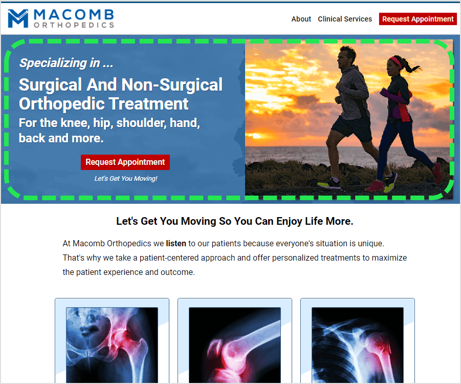
The second item to boost the effectiveness of your business website is to make sure you have a well-engineered headline area on your homepage.
It's this area at the top of your homepage:

Some people refer to this area as the "feature area", but I call it the headline area because just like with a newspaper or magazine article, it's where the reader decides whether or not they want to continue reading.
This headline area is the make-or-break point for your homepage.
Since your homepage is usually one of the most visited pages on your site, you should invest about 80% of your effort into getting this headline area right.
A good headline lets your reader know they're in the right place and it gives them a reason to keep reading.
A while back, I did a study where I analyzed over 1,000 medical websites and one of the biggest mistakes I saw was a vague or confusing headline area.
Many times I couldn't tell if I was visiting the website of a kidney specialist or psychiatrist because I'd see headlines like "Achieve Your Full Potential" or "Live A Pain-Free Life", neither of which tell me anything.
And I'm not just picking on medical websites because this is a problem on many websites.
Why?
Because good headlines are hard to write.
When developing a homepage headline, here's my million dollar tip # 1: Clarity beats cuteness. Every. Single. Time.
When in doubt, always, always (always!) err on the side of clarity and being direct, even if you think it might sound a little boring.
Remember, you're not trying to be Don Draper from Mad Men and appeal to the ego of some billionaire owner of a hotel chain.
Instead, you're trying to connect with a prospective client that's looking for an answer or a solution to their problem.
Here's my million dollar tip # 2: When writing your headline, speak to the problem you solve or the outcome you deliver.
Paint a picture of what your prospect's life is going to look like because they used your product or service
We could spend an entire day on how to write a good headline. But if you focus just on the two headline tips I just gave you, you'll have a headline that's better than 90% of your competitors.
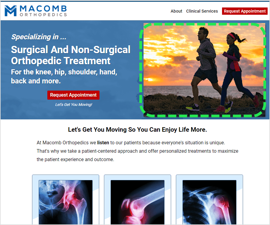
The last thing I'll mention about the headline area on your homepage is the feature image:

Don't just pick some random, generic image. Make it count. You want this feature image to support the headline and help tell the story like you're communicating with hieroglyphics.
Need help?
If "tech" just isn't your thing, we offer done-for-you services. Just click here and tell us what you need help with.
And now for the # 1 tip on my list of things that will move the needle and improve the effectiveness of your business website ...
#1: Looking the part:
This means that your site needs to project success, stability and expertise.
Like you know what you're doing!
Barbara Corcoran from the TV show, Shark Tank, says one of the biggest reasons she does not invest in someone is because they don't look the part.
You cannot have a site that looks amateurish or unfinished.
Looks matter. Presentation matters.
This isn't being shallow or phony. It's how things are. People do judge a book by its cover and they equate the quality of your brand with the appearance of your business website.
How do you know what a good website should look like? Well, the quickest and easiest way is just to look around.
If you're shopping for a new house or a new wardrobe, you just kind of know it. when you see it. It just jumps out at you.
If you want to upgrade or modernize the appearance of your site (but you're not exactly sure what it should look like) start keeping a list of sites you like.
When a prospective client comes to us wanting to redesign or do a makeover on their business website, the very first thing I ask them is, "What are 2-3 sites you'd like to model or emulate?"
We can design and develop anything they want, but it's a thousand times easier if they can just point to something and say, "I'd like something like this."
Don't try and reinvent the wheel. Use other sites for ideas and inspiration. It's WAY easier that way.
Conclusion
You now have what I believe are the top three things that will move the needle if you want a more effective business website that generates more leads, more clients and more profits.
To recap, the top 3 things are:
But ideas are a dime a dozen. What matters is taking action today.
