If you'd prefer to watch this on YouTube, click here.
If your website could talk, would it sound like a snooze fest?
If so, it might be driving away prospective clients without you even realizing it.
Today I’m going to share with you a diagnostic checklist so you can:
A simple diagnostic checklist to determine if your website might be boring
1. Does your hero section fall flat?
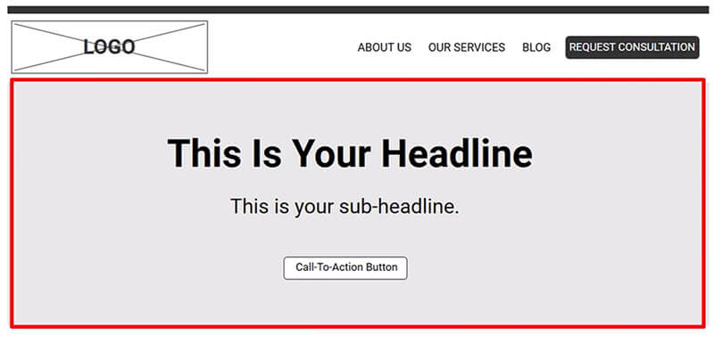
The hero section is the first thing visitors see at the top of your homepage. It’s your first chance to create visual impact and entice visitors to stay.

Does your hero section have a high-quality image or video that draws attention? If not, consider adding one. A high-quality hero image or a short background video can make a big difference.
For example, the hero image on TonyPolecastro.com (i.e. Tony's Acoustic Challenge) adds real visual interest:

Without a nice hero image, the page would look pretty plain as shown below:

StoryBrand.com uses a short background video that catches the eye and adds a dynamic touch:

Obviously, you don’t need a video background. A high-quality static image will work just fine. Either way, a visually interesting hero section background gives your homepage a little life and makes a great first impression.
2. Is your hero section headline too generic?
The headline in your hero section is one of the first things visitors read. If it’s too vague or generic, visitors might not know if they’re in the right place. They could spend too much mental energy figuring out what you do, which can cause them to mentally check out.
Therefore, make your headline client-focused and clear about what you offer. A strong, benefit-oriented headline tells visitors they’re in the right place. For example, “Helping You Reach Your Goals” is vague and generic, while “Get Personalized Financial Advice to Secure Your Future” is specific and clearly describes a benefit the reader might receive if they continue reading.
3. Does your text look like a wall of words or sound too corporate?
Long blocks of text can feel intimidating and boring.

Plus, if your copy sounds too formal—like a textbook or lease agreement—it can be hard for visitors to relate.
To fix this, break up your text with bullet points, sub-headlines, and short paragraphs.
Also, write like you talk. Use plain, conversational language that makes you relatable and approachable. This way, visitors feel like they’re hearing from a real person, not some corporate entity.
4. Are the images throughout your site low-quality or uninspiring?
Low-quality or stale stock images that you see on a million other websites can make your site feel like an amateur cookie-cutter template. If your imagery doesn’t feel unique or professional, visitors might lose interest.
Replace stale images with high-quality, relevant images that reflect your brand. Authentic imagery adds personality and helps your website stand out, making it look professional and engaging.
5. Does your site feel like a one-way conversation?
If your website just talks at visitors without any interaction, it can start to feel like a monologue.
Adding interactive features can break up the monotony and get visitors involved, making the experience more engaging and memorable.
Consider adding a simple interactive element, like a quiz, survey, or calculator. These touches give visitors something to do and make them feel like part of the conversation.
6. Do you have a welcome video?
A lack of human presence can make a website feel impersonal. A welcome video is a great way to introduce yourself and give visitors a feel for who you are. When someone watches a video, they’re getting more than just information—they’re also seeing your personality.
Add a short welcome video. It could be a simple talking-head video, or if you don’t want to be on camera, record a voiceover with images or animations.
Either way, a short welcome video adds a human touch and makes your site feel a little more lively.
7. Are your fonts and colors outdated or low-contrast?
Outdated or low-contrast fonts and colors can make your site feel like it’s stuck in a time warp.

If the design feels old-fashioned or hard to read, visitors might not stick around.
Give your fonts and colors a fresh look to create visual interest. Choose modern, high-contrast colors and clean, readable fonts to make your site feel current and inviting.
For example, Stripe’s hero section uses big, bold colors and fonts, and they also keep things visually interesting as you scroll down the page.

8. Is your page layout too predictable?
If your site stacks one section after another with no visual variety, it can start to feel flat and boring. A little movement here and there can wake visitors up and add a touch of surprise as they scroll.
Consider adding subtle movement with design elements like parallax scrolling, static backgrounds or CSS animations. These small touches break up the visual flow and keep visitors engaged without overwhelming them.
9. Is your website lacking a blog?
Without a blog, your site might only offer a surface-level view of what you do. A blog gives readers a chance to sink their teeth into more content and explore your expertise in detail.
Consider adding a blog to your site. It’s a great way to showcase your knowledge and provide in-depth content for those who are ready to dive deeper.
10. Are your pages or posts too brief?
If your content only offers quick general info, visitors might leave feeling like they haven’t learned anything meaningful. Adding detail shows that you have unique insights, not just the same soundbites everyone else is using.
Create thoughtful, well-rounded pieces that provide real value, whether it’s a sales page or a blog post. Adding specific insights and useful details can make your content feel credible and valuable without overwhelming readers.
How to keep your website interesting over time (without major overhauls)
Once you’ve made these initial fixes, it’s important to keep your website fresh over time. Here are a few ways to do that:
1. Spy on competitors for new ideas
When you’re not sure what to add or update, check out your competitors’ websites. See what they’re doing—new features, design tweaks or content they’re adding. This isn’t about copying; it’s about inspiration. Sometimes just seeing what others are doing can spark fresh ideas for your own site.
2. Keep a running list of ideas
If you get an idea for your site, write it down! Keep a list of design tweaks or new features you’d like to try. Without a list, ideas tend to slip away. This can be as simple as a note on your phone or a spreadsheet. Whatever works for you.
3. Schedule regular check-ins
Plan to update your site monthly or at least quarterly. Set a reminder on your calendar, because if it’s not scheduled, it’s likely to slip by. These small, regular tweaks keep your site fresh and prevent the need for major overhauls.
Conclusion
Your website is often the first impression for prospective clients, so it’s worth taking the time to make it engaging and memorable.
By focusing on a high-quality hero section, clear headlines, interactive elements, fresh images, and thoughtful content, you can create a website that visitors enjoy.
And by keeping a running list of ideas, checking in on competitors, and scheduling regular updates, your website can stay fresh and interesting without major redesigns.
