If you'd prefer to watch this on YouTube, click here.
Imagine a prospect lands on the homepage of your website and within seconds they feel an immediate connection.
They understand how you can help them, and they think, "Yes, this is exactly what I'm looking for!"
Unfortunately, without the correct homepage design, that instant connection probably never happens. They click the back button on their browser and then they're gone ... forever.
So, today I'm going to walk you through a simple step-by-step process for how to design a good homepage. And I promise, it's not as hard as you might think — that is, if you know what to do.
In this post, you'll learn:
Your homepage is like an introductory meeting
In real life, when you meet a prospective client, you want to make a good first impression.
You want to look nice (because looks do matter). You want to introduce yourself and briefly explain what you do and how you can help.
The homepage on your website needs to do the same thing. It should immediately let visitors know who you are, what you do, and most importantly, how you can solve their problem.
If you do a good job with your homepage, your visitors are much more likely to stick around and learn more about what you have to offer. Unfortunately, a lot of businesses don't do a good job with their homepage — frankly, because no one showed 'em what to do.
As a result, what often happens is they am just throwing a bunch of random stuff on their homepage just to fill up the space, which then leads to a cluttered and often confusing mess that drives prospective clients away.
And that's exactly what I'm trying to help you avoid today.
The step-by-step process for designing a good homepage
I like to call this a paint-by-numbers approach, where we just fill in the homepage section by section, which makes the process simple, even if you're not a design expert.
The Hero Section
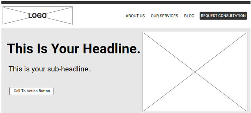
Starting at the top of your homepage is something called the hero section:
This is the very first thing your visitors see, so you need to make this count. In fact, I'd say 80% of your effort in creating your homepage needs to be focused on this top zone at the top of the page. That's how important it is.
Fun fact: The term hero section or hero image comes from traditional print media where the hero refers to the main headline and image at the top of the page, which is intended to grab the reader's attention.
Ideally, your main headline in the hero section should describe the problem you solve or the outcome you deliver. However, it's also perfectly acceptable to simply describe who you are and what you do, because a lot of websites don't even do that.
What you do not want to do with the headline is try to be cute or clever. Your visitors don't have the patience or mental bandwidth to try and decipher what your site is about. So you need to be clear, direct, and to the point.
And in addition to your main headline, it's also a good idea to add a sub-headline to support and further expand upon the main headline.
You also want to select an image that supports and communicates the main headline. I'll show you some real-life examples in just a second.
You also want to include a call-to-action button in your hero section to gently nudge your visitors to take the next step, whatever that might be.
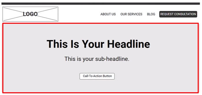
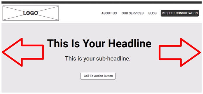
As far as what your hero section should look like, I generally use one of the following two layouts:
1. A full width layout where the image spans the entire width of the page, and then the headline is centered in the middle of the hero section.
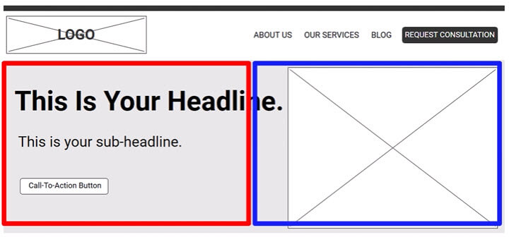
2. A 50/50 layout where half of the hero section contains the headline in the other half contains the hero image.
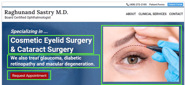
Here's one of my clients, a board certified ophthalmologist and eye surgeon where we're using the 50/50 hero section, which includes the headline, sub-headline, hero image and call-to-action:
Here's another one of my clients, a mold remediation specialist where we're using the full width layout. Once again, headline, sub-headline, and the hero image (which is the nasty mold which spans the full width of the hero section):
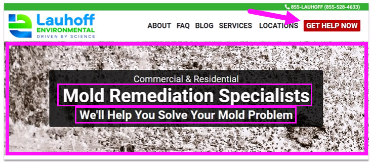
Note: With this site, we didn't include the call to action button in the hero section because it's appearing immediately above it in the main navigation.
The Agitate Section
Below the hero section is where you want to briefly agitate the pain point to focus your prospect's attention and gently remind them why they need your service.
You can then pair that copy with an image or video that reinforces your message and shows how you provide that solution.
For example, if you're a financial planner that might look something like this:
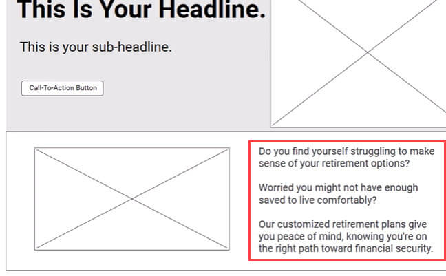
Do you find yourself struggling to make sense of your retirement options? Worried you might not have enough saved to live comfortably? Our customized retirement plans give you peace of mind knowing you're on the right path toward financial security.
You could then pair this copy with an image of a financial planner sitting at a desk with a relaxed, smiling couple reviewing documents together.
The Benefits Section
The next section is the benefit sections showing how your service will make your prospect's life better. What you want to do is pick three or four benefits your service provides, coupled with the feature that makes that benefit possible. Remember:
I also like to pair each benefit with an image that amplifies that benefit.
Let's continue on with our financial planner example:
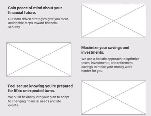
I often like to use a zigzag pattern (as shown above) to break up the monotony on the page and make things look more visually appealing.
The Testimonials Section
You now want to show some testimonials because you can never have too many people singing your praises. Prospects usually care more about what other people say about you than what you say about yourself.
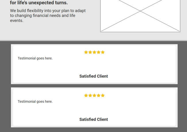
If you don't have client testimonials, but you do have clients that are pleased with the work you've done for them, no worries. I got you covered. I have an entire video that explains my simple step-by-step process that makes getting testimonials a breeze.
The Feature List Section
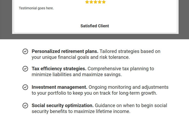
As I'm sure you've heard, people buy with emotions, but they justify their buying decisions with logic. Therefore, we want to include a section with a list of features to satisfy the left brain of a prospect. It's just kind of the raw facts of what you get.
Once again, using our financial planner example, their feature list might look like this.:
The FAQ Section
Then the last section of a good homepage would be an FAQ section.
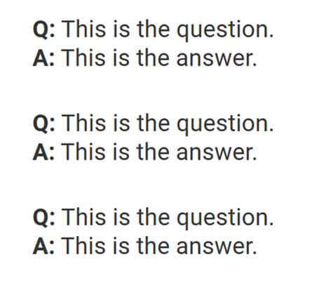
You can do the classic Q & A format like this:
Or, what I like to do is create FAQ toggles to create a little interactivity, as shown below:
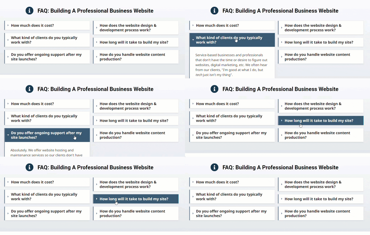
Plus, if you have a lot of FAQs with long answers, these FAQ toggles can make your page more inviting so your prospect doesn't have to process a scary wall of long text.
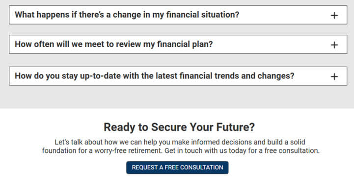
Here are a few example FAQs using our financial planner example:
As with the features list, list as many FAQs as you can.
The Call-To-Action Section
Lastly, at the bottom of your page, you always want to prompt your prospect once again to take the next step with you, whether that's requesting a free consultation, watching a free video or whatever.
Your completed homepage
So let's look at what we just built top to bottom.
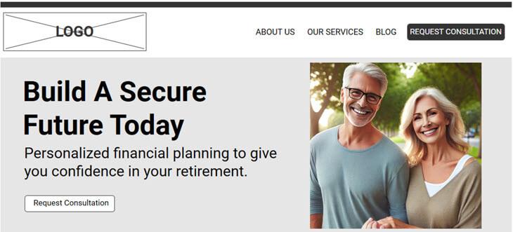
At the top, we have the hero section. Using our financial planner example, the headline might read, "Build a Secure Future Today" with the sub-headline reading, "Personalized financial planning to give you confidence in your retirement." The visual could be an image of a mature couple smiling and relaxed, walking hand in hand in a park, representing the security and peace of mind that comes with a solid financial plan.
Expanding your homepage?
You might be wondering, "Can I add additional content over and above the sections outlined above?"
Of course. Just be careful not to overwhelm your visitor because oftentimes less is more.
I'm a big believer in keeping things simple and being "brilliant at basics" and "focusing on fundamentals". Because, if you do that, I guarantee you're going to have a homepage that's better than 80-90% of your competitors.
In addition to your homepage, you also need this
Before a prospective client clicks the "Request a free consultation" button, they often want to know a bit more about you — such as your experience, your credentials, or other relevant details.
And that's why you also need a good About Us page. You can check out my free guide that walks you through the step-by-step process of how to create a good About Us page right here.
