If you'd prefer to watch this on YouTube, click here.
Here are 8 things you should remove from your website immediately (and 3 things you should to add) to boost your website's conversion rate and elevate your brand.
NOTE: I'm making these recommendations as someone that designs and develops business websites for a living as well as a consumer visiting a website — possibly looking to hire a service professional, whether it be a healthcare provider or a roofing contractor.
Let's begin with the easy and obvious things to remove from your website ...
1. Remove the outdated copyright date in the footer.
When I visit a new website, one of the first things I look at is the copyright date in the footer. It's shocking how many websites are not displaying the current year.
The copyright date gives you an indication, either actual or perceived, as to how current and up-to-date the information on that website is.
Think of it like this: How do you feel about reading a newspaper that was published a year ago, let alone a week ago? You're going to wonder, "Is the information still accurate and relevant?" Same thing applies to your website.
The copyright date also signals that company's attention to detail.
At first glance, reviewing the copyright date might sound a little nitpicky or trivial, but I promise people notice this stuff.
2. Remove unreadable fonts.
Data indicates about 2 out of every 3 people either wear glasses or contacts. So you cannot be using fonts on your website that are difficult to read. Get rid of them.
By unreadable, I mean:
If I land on a website where I have to strain to read the text, I'm gone in about two seconds.
3. Remove social media icons leading to ghost towns.
Many people display social media icons on their website because they think it looks cool and hip. But then when people click on these social media icons, they're taken to a social media ghost town that shows no activity for months, sometimes even years.
That is not a good look.
If you're not active on a particular social media platform, get rid of that social media icon from your website.
If you're displaying social media icons in the header or main navigation of your website, why would you want to encourage people to leave your site and go to those social media platforms?
Remove those social media icons from the top of your site and move those icons to the bottom of the page and put them in your secondary navigation. If someone really wants to connect with you on social media, they'll know to look for those links at the bottom of the page.
4. Remove the "date published" from blog posts or articles.
Some of the best content on your site will often be several years old. And by default, many WordPress themes will automatically display the date that article or blog post was originally published.
Let me ask you a question, "What are the odds of you reading a piece of content if you see that it was published 3, 4, 5 years ago?
Answer: slim-to-none. So get rid of the "published on" date and replace it with the date the content was last updated. Most modern WordPress themes have dynamic text tokens that will do this for you automatically.
One of the most popular blog posts on my website is "How much does it cost to build a website?" The original publish date was March 2017. But since then, I have updated that post a gazillion times, as recently as a few weeks ago.
If you want people to consume your content, they need to feel confident that is current and up to date.
5. Remove the "welcome" section on your homepage.
Nothing screams circa 2004, like a greeting on your homepage that says, "Welcome to our website. We are thrilled to have you here. Our website is your one-stop destination for all things related to ... ".
You get the point. It's pretty cringe. And I kid you not, I saw one of these just yesterday.
Get rid of these. They're outdated and unnecessary. Instead, get into your content immediately and start delivering value to your visitor right from the get-go.
6. Remove walls of text.
Your site should not feel like your visitor is reading a lease agreement.
Website visitors do not like long paragraphs because they look scary and painful to read.
What you want to do is break up long paragraphs into smaller bite-sized paragraphs that are easier to consume.
You can also break up walls of text by sprinkling in a few images to make the page more palatable. Just like when you were a kid flipping through a book, the decision to read often hinged on, "Are there any pictures?"
7. Remove complicated navigation menus.
Keep things simple.
Visitors that get confused or overwhelmed often do nothing or leave.
Therefore, only put the most important items in your site's main navigation at the top of the page. Everything else, put in the secondary navigation at the bottom of the page.
This is exactly what grocery stores do — the stuff they really want you to buy, they put at eye level and the less important stuff they put on the bottom shelf.
8. Remove any vague, unspecific homepage headline.
You might've heard me mention in one of my YouTube videos about the study I did a few years ago where I visited over a thousand medical websites to compile a list of what they were getting right and what they were getting wrong.
One of the most common mistakes I saw was a vague unspecific homepage headline. I'd see things like "Be Your Best Self" or "We'll Help You Get More Out Of Life", which tells me nothing.
Instead, you want to be clear and direct so the reader immediately knows what your site is about.
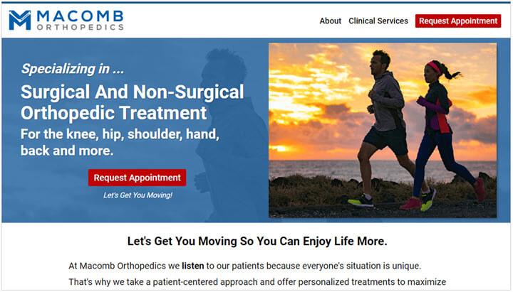
Here's an example from one of my clients: Macomb Orthopedics, "Surgical and Non-surgical Orthopedic Treatment for the knee, hip, shoulder, hand, back, and more." You know exactly what they do.

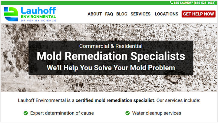
Here's another one of my clients: Lauhoff Environmental, "Mold Remediation Specialists. We'll help you solve your mold problem." Again, it tells you exactly what they do.

Clear and direct beats cute and clever every day of the week.
So those are 8 things to remove from your website immediately if you want better website conversions and a better brand image.
And as promised at the beginning of this post, I'm now going to share three things to add to your website if you want to boost your brand and improve conversions.
1. Add a headshot to your About page.
It's true, many people are camera shy and they do not like having their picture taken. But to have the strongest connection possible with prospective clients, you need to post a picture of yourself on your website.
It doesn't have to be fancy. You do not need to look like a supermodel. And you do not need to hire a professional photographer. The camera on your phone is more than sufficient.
Prospective clients just want to put a name with a face and see who they might be doing business with.
For tips on how to take a professional headshot with your phone, check out my free guide, "How To Take A Professional Headshot With Your Phone".
2. Add more testimonials.
The more, the merrier. Add as many testimonials as you can throughout your site. You can never have too many people singing your praises.
However, a common sticking point is that it can sometimes feel a little awkward asking clients for testimonials. The way you solve that problem is by having a proven step-by-step process that removes all the guesswork.
And guess what? I have a free guide, "How To Ask For A Testimonial: My Simple, Repeatable Process".
3. Add pricing.
Every single person thinking about hiring you wants to know how much you charge.
So list your prices on your website.
Occasionally I'll get a little pushback from clients because they sell a high-ticket item and they're afraid they'll scare people away by publishing their pricing.
If this describes you, I got news for you ... prospective clients have already been doing their research online for days, weeks, even months ... and they already have an idea of what things cost. So just go ahead and publish your prices and be transparent.
If anything, you'll probably make prospective clients nervous by not publishing your prices.
The other reason why businesses are sometimes reluctant to publish their prices on their website is because every project is unique and requires a custom quote. Okay, fair enough.
But at least you can give prospective clients a ballpark figure of what you charge by saying things like "starting at" or give them a range of what things typically cost. Then after you get further details, you can provide them with a custom price quote.
Conclusion
You now have 8 things to remove from your website immediately, as well as 3 bonus items to add to your website immediately that I promise will:
How does your website stack up? Do you have some work to do???
