Does your business website need a homepage makeover?
If so, below is a cheatsheet on homepage website design in 2025, chock full of tips, ideas and real-world examples. No technical skills required. 😉
Let's begin by answering an important, but often glossed over question ...
What Is The Purpose Of Your Homepage?
Homepages are unique because they have multiple purposes, which is why they can be difficult to design.
At a minimum, your homepage needs to communicate fundamental information about your your product or service such as:
But your homepage also needs to evoke a feeling.
Before your prospective client engages with you they need to feel you're legit, you can be trusted and you can actually help them.
And it's your homepage where visitors often make that determination.
That's why you can't just throw random stuff on your homepage if you want it to persuade people to take the next step with you.
Homepage Design Best Practices
Good homepages don't happen be accident.
Here are 12 tried and tested best practices for creating an awesome, conversion-focused homepage in 2025:
And just so you know, these 12 homepage design best practices are universal. They apply to ALL industries.
How Long Should A Homepage Be?
Short answer: As long as it needs to be.
Seriously, there is no set rule.
If you can communicate your message quickly and with minimum content, a short homepage is perfectly fine.
On the other hand, if your product or service requires a bit more explanation with FAQs, videos, etc. — resulting in your visitor scrolling a longer homepage ... that's fine, too. People will absolutely read a longer page as long as your content is relevant.
One of the homepage design best practices listed above is "be clear and concise". That may or may not mean your homepage is short. It's entirely possible to be clear and concise, yet somewhat lengthy.
Bottom line regarding the length of your homepage (or any page on your site): Say what you have to say, no more or no less.
Examples Of Good Website Homepage Design
Needs some ideas and inspiration for your homepage?
As they say, a picture is worth 1,000 words.
Here are some homepages I like ... and why I like them.
Branch Tree Service:
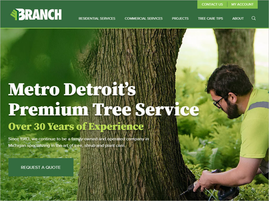
The Branch Tree Service homepage is a textbook example of a well-designed homepage. Great hi-resolution feature image. Big, bold, clear headline leaving no if-ands-or-buts about what this website is about. Color scheme is overwhelmingly green for trees. (Duh!) Clear, simple navigation. And they worked in a picture of a human. Facebook did a study a few years ago showing that — all things being equal — visitors usually respond more favorably to images with people than images without people. They have a large call-to-action button (Request A Quote) prominently displayed above-the-fold. Lots to like about this homepage.
Modern Obstetrics & Gynecology:
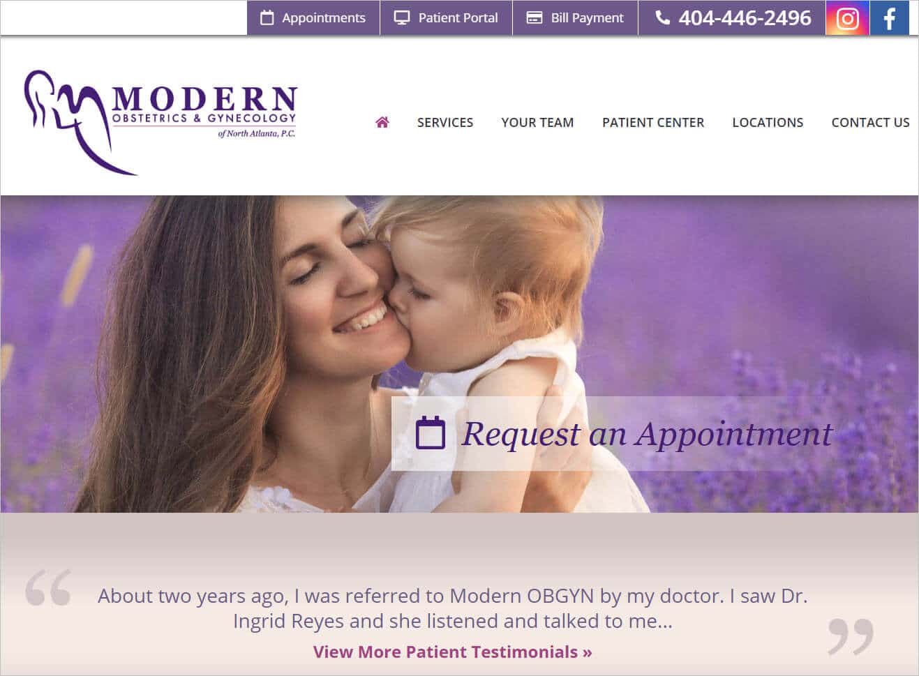
During a website redesign project, a client shared this site with me as one they'd like to emulate. This is a really nice site. Excellent logo. Clear, simple site navigation. They also have a secondary navigation bar at the very top of the page for existing clients (patient portal, bill payment, etc). The screenshot above shows only one feature image, but the actual site shows multiple, beautiful hi-res images leaving no doubt this is an OB-GYN office. Even though this site doesn't not have a traditional headline at the top of the page, their logo plus the feature images plus the testimonials right below the feature images clearly communicate what kind of medical office this is. A purple color scheme can be tricky, especially on a professional services site, but this homepage pulls it off nicely.
NordicTrack:
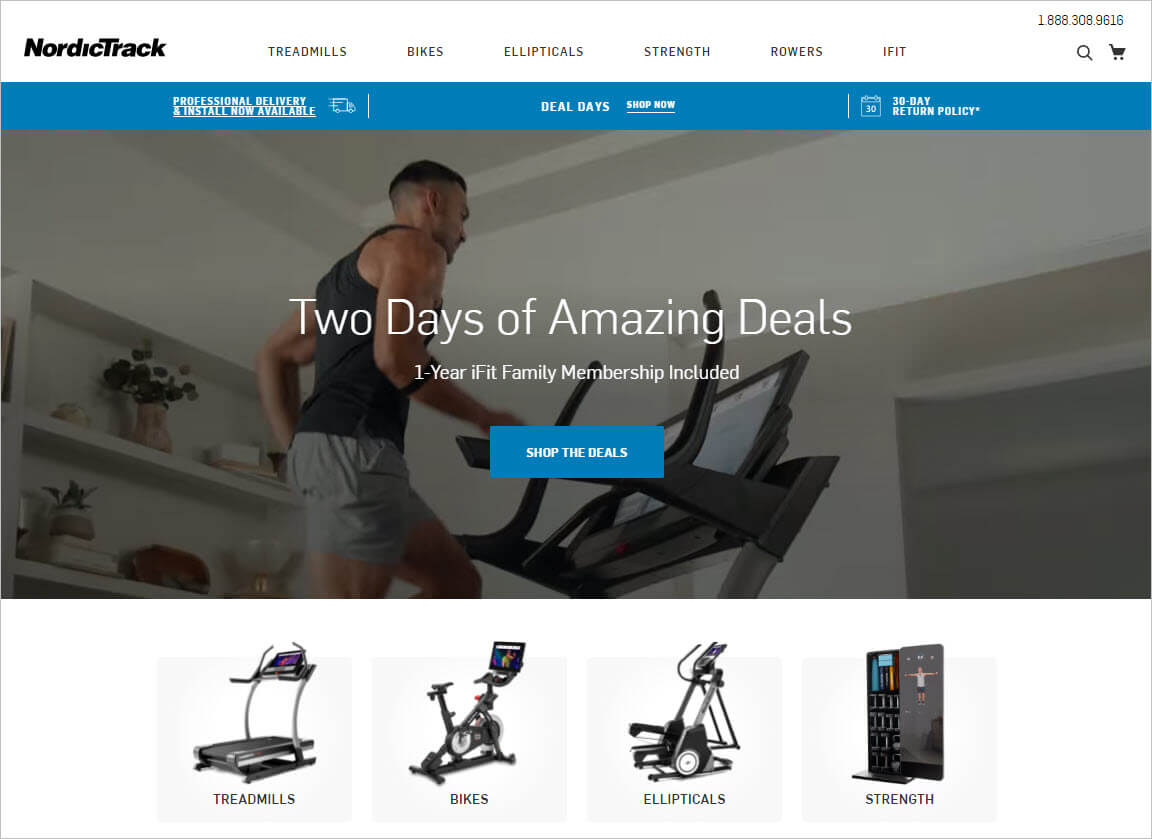
The NordicTrack homepage uses clean, modular design with each module showcasing a product category and a link to dive deeper. Pretty much everyone's heard of NordicTrack so their homepage headline doesn't need to explain who they are and what they offer. Instead, NordicTrack's homepage headline focuses on their offer. By landing on their site, they assume you're shopping for exercise equipment so they immediately want to get you into purchasing mode. NordicTrack masterfully gets your vanity glands going by using buff fitness models to tap into your aspirational desires of wanting a beach body.
DecksDirect:
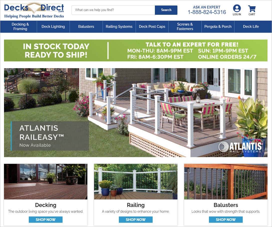
The logo itself on the DecksDirect homepage tells you exactly what this site's about. Their headline "IN STOCK TODAY READY TO SHIP" creates a little urgency and signals that if you're ready to buy, go get your credit card *right now*. Their homepage has a lot of stuff on it, but it's so well-organized it doesn't feel like a chaotic mess. This homepage is yet another example of why it's usually worth investing in a professional photographer. The product images look amazing and of premium quality. If you're in the market for any kind of deck accessories, this homepage makes you feel like you're search is over — they'll have anything (and everything) you're looking for.
Ring:
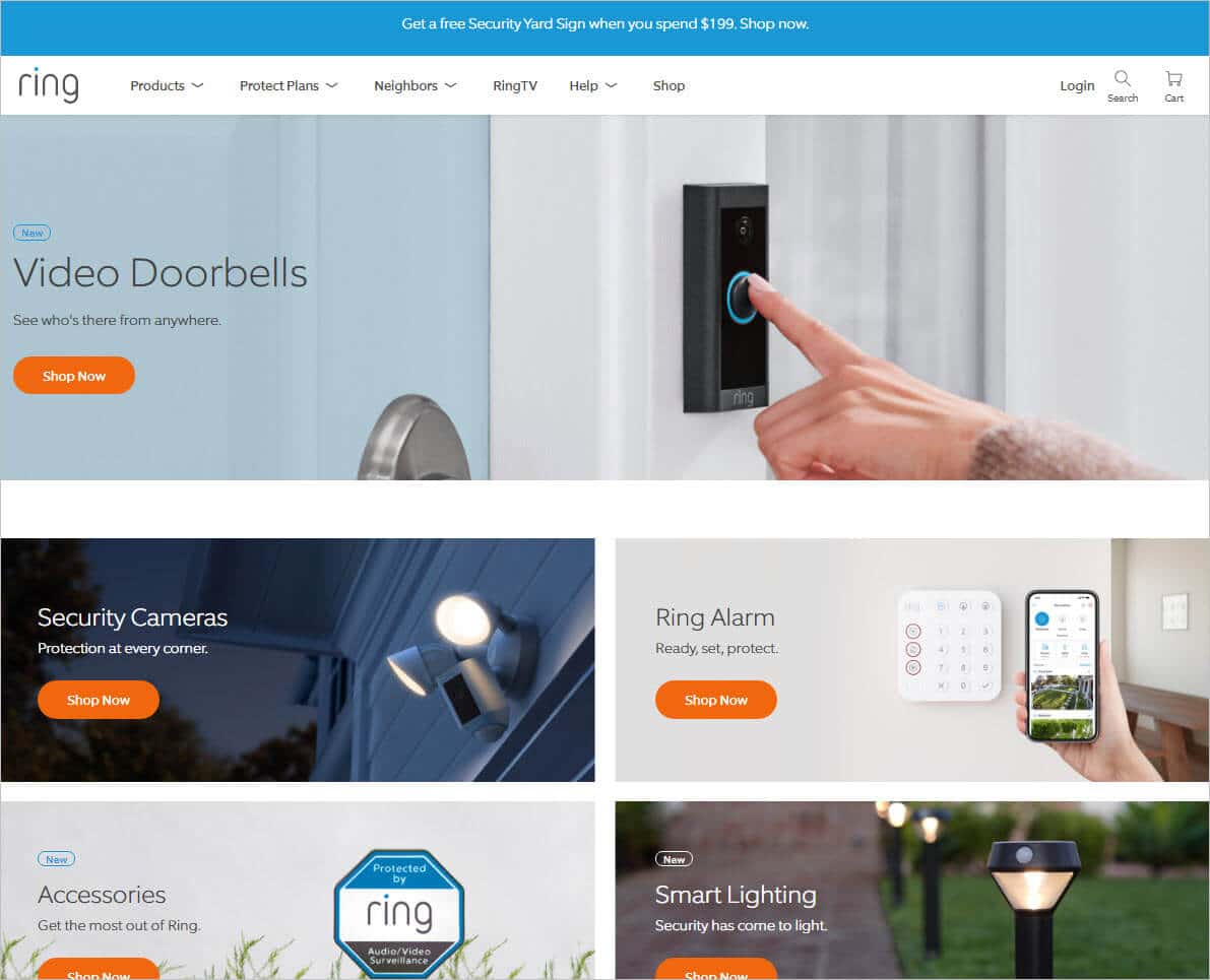
The Ring homepage uses a simple, uncluttered minimalist design. Like NordicTrack, everyone's heard of Ring. So their headline is simply, "Video Doorbells". But in the past few years, Ring has branched into tons of complementary products such as security cameras, security lighting and more and their homepage provides quick links to all those product categories. Hidden bonus: In case you didn't know, Amazon purchased Ring in 2018. Since Amazon is one of the richest companies on the planet, they have the resources to hire the best web designers on the planet. Translation: If this is the homepage that Ring is using, you can be very confident this design has been tested and it *works*.
Chuck E. Cheese:
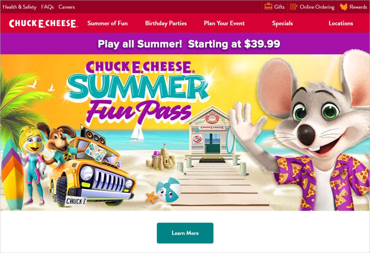
The Chuck E. Cheese homepage is all about COLOR. It screams excitement! In addition to the loud colors, the fonts and imagery leave no doubt this homepage is about kids and fun. The homepage has tons of call-to-action buttons prompting you to take the next step (and have some fun!) Clearly, this color scheme would not work for a dental office, but it works great for a place like Chuck E. Cheese. I included this homepage example as a reminder that there isn't a one-size-fits-all template for the perfect homepage. You have to adapt your homepage design for each situation. Although the Chuck E. Cheese homepage is "vibrant", it's actually very well-organized and user-friendly.
ProtonMail:
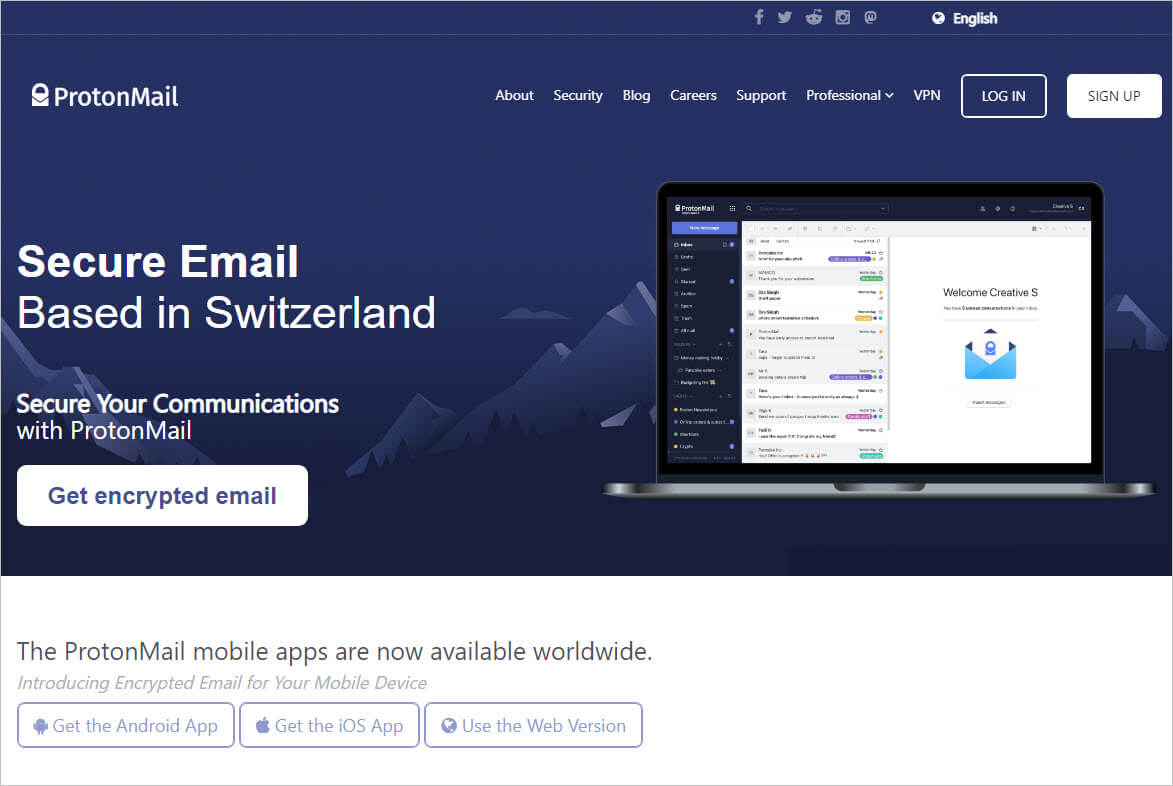
The ProtonMail mail homepage is another example of clean, minimalistic design. Because ProtonMail's main selling point is secure email, it's no accident they use blue as their predominant color. (Blue is universally associated with security. Think police uniforms.) To further emphasize their selling point of security, they emphasize Switzerland and the Swiss Alps because historically Swiss bank accounts are associated with security and high levels of privacy. If you're looking for a modern, professional, but no-nonsense homepage design, definitely check out ProtonMail .
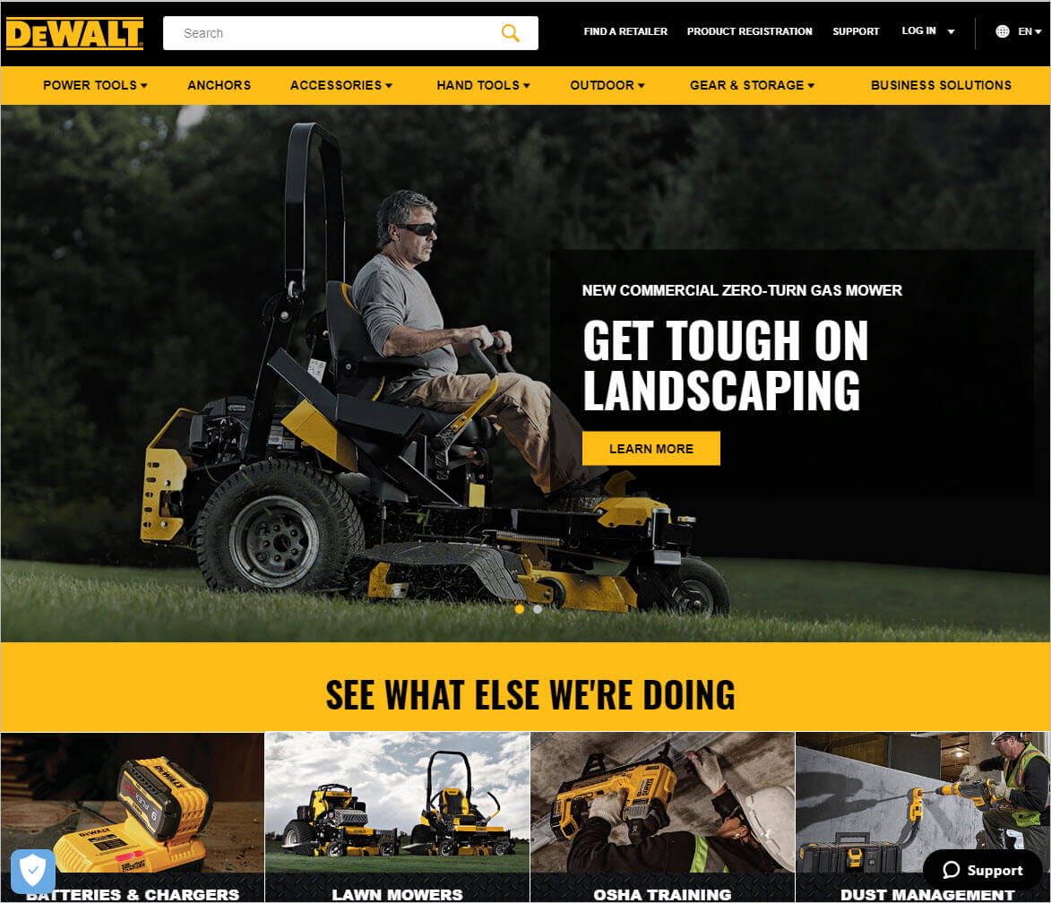
DeWalt:
The DeWalt homepage oozes with testosterone. Their imagery, color scheme and fonts all project "bold and tough". The layout of their homepage uses squares and hard edges (as opposes to gentle curves) further projecting "rough and rugged". They're in the power tool business, so clearly they want their homepage to project strength and durability. In addition to the emotive aesthetics, the information on the DeWalt homepage is very well organized and provides a good user experience.
Conclusion
Great homepages don't just magically happen.
They require a lot of thought and planning.
Today we pulled back the curtain to reveal how to create an effective homepage for your website.
If you know of a website with a well-designed homepage, please list it in the comments below. We'll check it out and maybe showcase it in our post above!

Well-covered topic. Keep sharing valuable content. Thanks for sharing. Our team will be excited to read this.